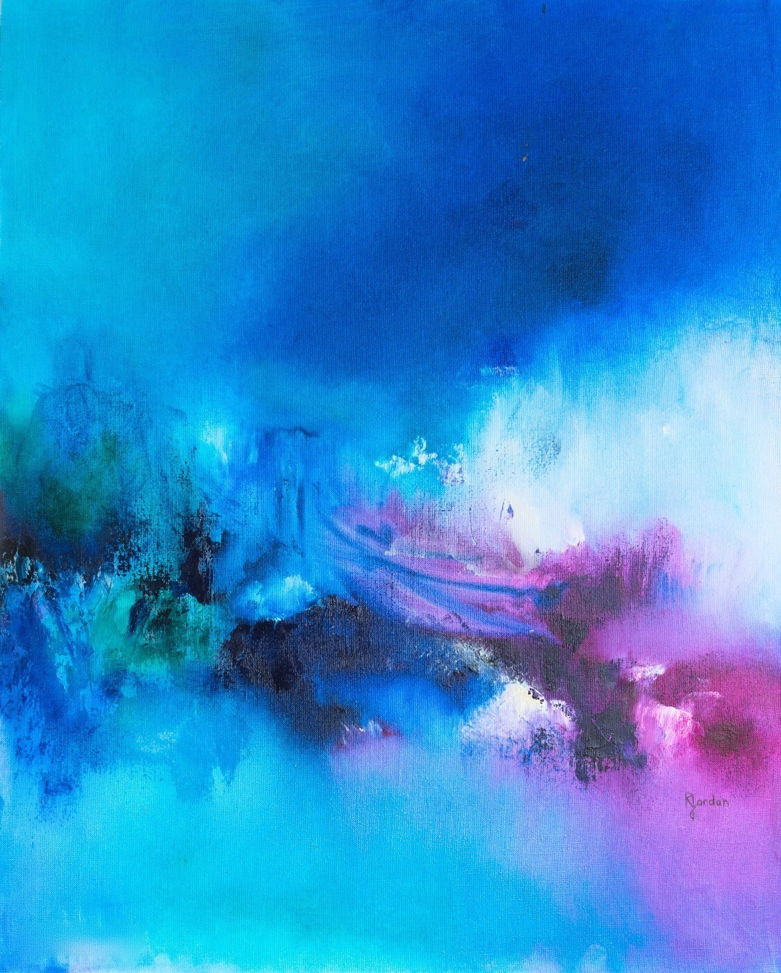
Which Bedroom Colour? What Designers Say, And What Science Actually Measures
23 August 2026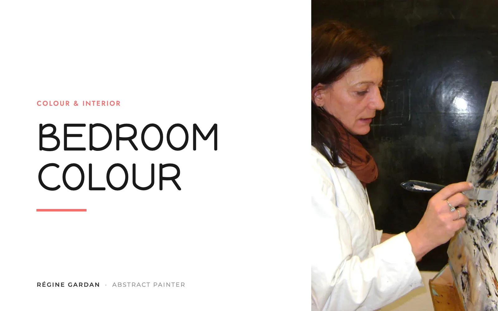
TL;DR
- Designers recommend soft, desaturated blues, soft green, powder pink and warm whites for a bedroom.
- The famous “blue = 7 hours 52 minutes” figure comes from a 2013 Travelodge press release: no method, no scientific journal.
- Science has measured that evening screen light disrupts sleep (Harvard, 2015) and that bright red excites the brain (Lund, 2009).
- 2026 trends: pale mineral blue, ochre and sienna, soft browns and earthy pinks; saturated darks and cold greige are out.
Hi, I'm Théo! My mother painted more blues than any other colour apart from red: the collection holds forty-one of them today. When you go looking for a bedroom colour, that is often where you end up, and it is no accident. Here is what designers recommend and, less often heard, what science has actually measured.

Régine Gardan
An Award-Winning Artist, 1964 - 2018
- 25+years of painting
- 200+hand-painted canvases
- 35+exhibitions
- 14awards & honours
Bedroom Colour: What Designers Recommend
Colour psychologist Karen Haller, author of The Little Book of Colour, told Ideal Home in 2019 that there is no right or wrong bedroom colour as long as it feels like you, with one exception of her own: avoid yellow, which she links to the nervous system and which hotels do not use in bedrooms. Her most restful shades: soft green and powder pink.
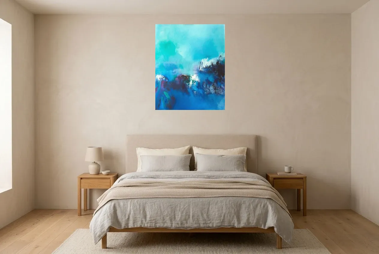
In Livingetc (January 2026), interior designers Rebecca Hughes and Isy Jackson recommend soft, desaturated blues, pointing out that an intense blue does the opposite; Ginger Curtis (Urbanology Designs) prefers a warm off-white to a pure white, with Pantone's Cloud Dancer, colour of the year 2026, judged too stark for a bedroom. So three families come up again and again: soft blue, soft green, powder pink, with warm whites to go alongside them.
“Blue Gets You 7 Hours 52 Minutes Of Sleep”: Where That Really Comes From
You have probably come across this figure. It comes from a press release by the Travelodge hotel chain, dated 17 May 2013, which claims to have “looked through the keyhole” of 2,000 British homes. No author or method for the study itself, no scientific journal, and sleep most likely self-reported; two commentators are quoted after the fact, sleep expert Chris Idzikowski and a colour therapy consultant. The same release, incidentally, ranks yellow as the second-best colour, and explains that silver “shines like moonlight and tricks the eye into thinking it is night-time”. It is marketing, and it went around the world.
What Science Actually Measures
What is solidly established concerns light, not the colour of the walls. The study by Chang, Aeschbach, Duffy and Czeisler (Harvard, PNAS, 2015) compared evening reading on a backlit e-reader with reading a paper book: with the screen, falling asleep takes longer, melatonin is reduced, the circadian clock is delayed and alertness is lower the next day. What science has actually validated in the bedroom is the short-wavelength light of screens and cold LEDs in the evening, long before the paint.
On walls, one of the few series of experiments carried out in real painted rooms comes from Küller and Janssens (Lund University) with Mikellides (Oxford Brookes), a synthesis published in 2009 in Color Research & Application: strong colours, red above all, put the brain in a more excited state, and introverted people or those already in a bad mood react to them more. That is the measured argument against bright red in a bedroom. For the rest, Andrew Elliot, the leading academic authority in the field, writes in his 2015 review that this area is “at a nascent stage” and recommends “patience and caution” before any application. An honest article therefore cannot say that “blue soothes”; it can say that blue is the colour we prefer.
And that is a documented fact: the historian Michel Pastoureau points out that, ever since surveys started asking the question, more than half of Europeans name blue as their favourite colour, with green next at around 20%. Blue in a bedroom is not “scientifically soothing”. It is first of all the colour people love most, which, for a room you wake up in, matters more. Our guide to the meaning of colours says what each one evokes, sources included.
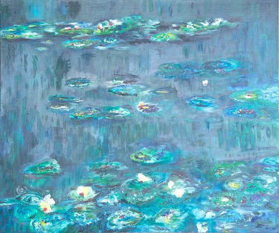
“Nénuphars” (55 × 46 cm) sits between the two families designers recommend, soft blue and soft green, in a small format suited to a narrow bedroom wall or a bedside table. It belongs to the collection of blue paintings.
Bedroom Colour Trends For 2026
Livingetc (June 2026) sets pale “mineral” blue as the new neutral, illustrated by a bedroom by Julia Miller (Yond Interiors); aubergine comes in as accents (Shannon Shlom and Dominique Brammah, studio Duet), ochre and sienna bring warmth, with sienna applied by Cetti Wearmouth (Tiano Studio) to bed linen and headboard, and soft browns pair with earthy pinks. Leo Wood (Kinder Design) observes that a pale wall is no longer the obligatory synonym for calm: their clients now accept deep, enveloping colours as every bit as restful, and Andie Hamm gives the example with an ochre alcove painted from floor to ceiling.
What is on its way out, according to Homes & Gardens (April 2026): very saturated dark tones, anthracite, near-black, navy, which weigh on a room made for unwinding (Barrett Oswald), and the cold greige that “goes with everything” and goes with nothing (Flora Slater, Studio Flora London). Livingetc confirms the same shift on 2 April 2026.
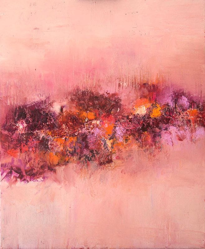
“Fleurs de Rose” (50 × 60 cm) is Karen Haller's powder pink, with what the 2026 trend adds to it: earthy touches, raspberry and orange. On an off-white wall, it makes the bedroom without weighing it down; you will find it in the collection of pink paintings, and our article on why hang an abstract pink painting says what to pair it with.
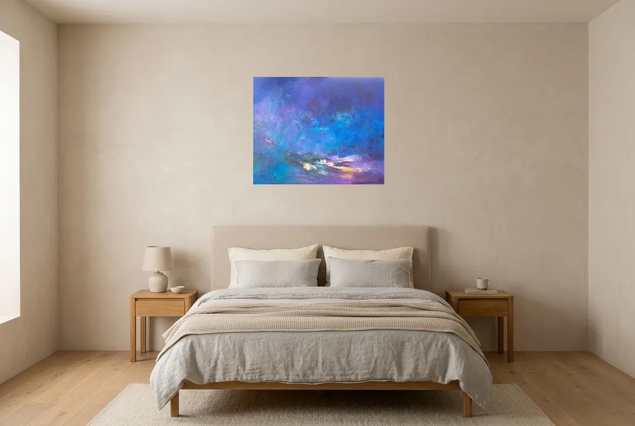
“Deep, luminous paintings that touch our heart and our soul...”
Where To Hang The Canvas In A Bedroom
Above the bed, the rule comes from Kelly Cahn, art adviser and certified appraiser (Livingetc, December 2025): centre the work at around 150 cm from the floor and, above a headboard, leave 15 to 30 cm between the top of the furniture and the bottom of the frame; framer Jason Wickens points to the 57-inch rule, 145 cm to the centre, used by galleries. For width, aim for two thirds of the bed's width. Formats by wall are detailed on the abstract painting for the bedroom page, and how to fix it to the wall in how to hang a painting.
Frequently Asked Questions
What Is The Best Colour For A Bedroom?
The one that feels like you, Karen Haller answers, with three families designers cite most: soft, desaturated blue, soft green, powder pink, on warm whites. The only clear-cut negative verdict is hers: avoid yellow in a bedroom.
Does Blue Really Help You Sleep?
Nothing proves it: the “7 hours 52 minutes” figure comes from a 2013 Travelodge press release, with no method and no scientific journal. What has been measured is the effect of screen light in the evening (Harvard, 2015). Blue remains the colour most people prefer, which is a good reason to choose it.
Should You Avoid Red In A Bedroom?
Bright red, on the whole, yes: experiments in real painted rooms (Küller, Mikellides and Janssens, 2009) show that strong colours, red above all, put the brain in a more excited state. A dark red or a touch of red on a canvas does not pose the same problem.
Which Bedroom Colour Is On Trend In 2026?
Pale mineral blue as the new neutral, ochre and sienna, soft browns with earthy pinks, and aubergine as accents (Livingetc, June 2026). Very saturated darks and cold greige are on their way out (Homes & Gardens, April 2026).
Choosing The Canvas You See When You Wake
What you see when you open your eyes matters more than what a press release promises. Browse the collection, the blues, the greens and the pinks first, or start with who you are, using the guide to choosing a painting to suit your personality.