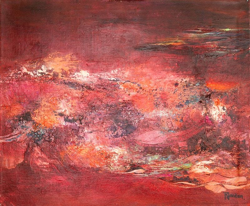
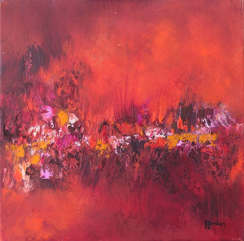
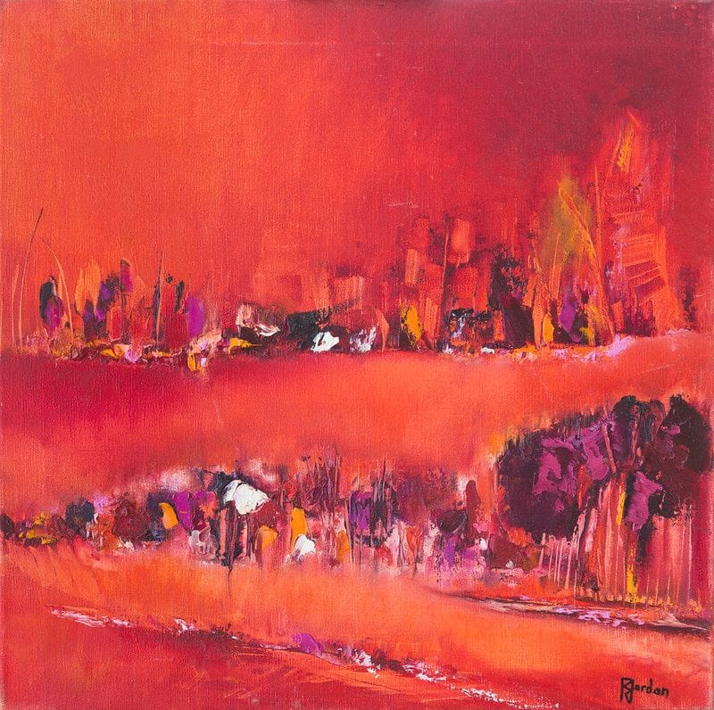
18 original works in this collection.
Small, warm formats, chosen for the crowded walls of a kitchen, with the precautions that go with them.
See all the worksWhat size of painting for your wall?
Hang it with the centre about 1.60 m from the floor, leaving 15 to 25 cm above the furniture.
Bare wall (no furniture)? An 80 to 100 cm format structures the space on its own.
It is often the room where you spend the most time on your feet, and yet the one you decorate least. Wall units, splashback, appliances: only fragments of wall are left, and you give up.
That is a pity, because those fragments are enough. A kitchen does not need a large canvas, it needs one well-placed point of colour.
Two constraints govern the choice, and they point the same way: small format.
The first is available space. Between the top of the splashback and the underside of the wall units, there is rarely more than fifty to sixty centimetres. On the wall of an eating corner there is more, but you have to reckon with the table and chairs.
The second is viewing distance. In a kitchen you are always close to the walls. A canvas is looked at from a metre or less, which makes the small format not merely acceptable but preferable. This selection therefore keeps works of sixty-five centimetres at most, complemented by our small formats.
It has to be said plainly: an oil painting on canvas likes neither steam nor grease splatter. That is no reason to give up, but the placement has to be chosen with some method.
What to avoid absolutely: the wall directly behind the hob, the wall above the sink, and any spot within a metre and a half of a regular source of steam. Airborne grease settles on the material and becomes very hard to remove without damaging the paint.
What works very well, on the other hand: the wall of the eating corner, the wall facing the worktop, the space above a sideboard or trolley, and the wall of an open kitchen on the living room side. In a well-ventilated kitchen with an effective extractor, these placements pose no problem at all.
Our guide on caring for an abstract painting details how to clean an oil on canvas and, above all, what never to do, such as using a household product or a damp cloth.
The canvases gathered here are warm and clean, and that is no accident. Warm shades, oranges, reds and yellows, are traditionally associated with appetite and conviviality, and they work particularly well in a room where you are active.
They also have a practical advantage: a kitchen holds a lot of neutral surfaces, white, steel, pale wood. A colourful canvas stands out there immediately, where a work in muted tones would blend into the cabinet fronts.
If your kitchen is already colourful, bright fronts or a patterned splashback, reverse the logic: a calmer canvas, in a wabi-sabi spirit, will settle the whole rather than overload it.
The wall of the eating corner is the most obvious and the safest. Hang the centre of the canvas about one metre fifty-five from the floor if you eat standing at a counter, a little lower for a classic table where you sit.
The stretch of wall between two wall units suits the smallest formats. Centre the canvas within the available space rather than on the whole wall, otherwise it will look off.
The wall of an open kitchen, on the living side, allows larger formats and links the two spaces. In that case, choose a canvas that picks up a colour already present in the living room: see our living room canvases to keep the two rooms coherent.
This is a distinction that genuinely changes the selection, and it is often forgotten.
In a closed kitchen, the canvas only converses with the kitchen itself. You are free to choose a clean bright colour without worrying about the rest of the home, and it is a chance to risk a shade you would not have put in the living room. Formats stay small, placements safe, and the whole is thought of as a bubble.
In a kitchen open to the living room, the work is visible from the sofa. It therefore belongs visually to both rooms, and has to agree with whatever is already hanging on the other side. Two methods work: share a common colour between the two canvases, or stay within the same style family, for example two bohemian works or two Scandinavian ones.
What to avoid in an open kitchen: a very colourful canvas on the kitchen side and a very neutral one on the living side. The eye compares them constantly, and the second looks bland.
Every work shown here is an oil on cotton canvas painted by Régine Gardan, signed and delivered with its certificate of authenticity. The edges are painted: no framing is needed, which is a real advantage in a kitchen, where glass would fog and mark.
Original artwork or reproduction: what really changes
| Original artwork (oil on canvas) | Industrial reproduction | |
|---|---|---|
| Texture | Real relief of the pigments, light catches the surface differently through the day | Flat surface, identical look whatever the light |
| Uniqueness | One of a kind: a single one in the world, yours | Mass-produced, thousands of identical copies |
| Authenticity | Signed by the artist, certificate of authenticity included | No original signature, no certificate |
| Over time | Oil paint lasts for generations and can be passed on | Wears out and gets replaced like a decor item |
| What you own | The real work of an artist, with its story | A licensed printed image |
Small formats, sixty-five centimetres at most, in warm tones. Kitchens hold a lot of neutral surfaces, white, steel and pale wood, so a colourful canvas stands out immediately where a muted one would blend into the cabinet fronts. You also always view it from close up, which makes a small format preferable.
Choose the placement before the piece. The eating corner, the wall facing the worktop and the space above a sideboard all work well. Avoid the wall behind the hob and above the sink, and anywhere within a metre and a half of regular steam, since airborne grease settles into the material.
Small formats grouped near an eating corner, and a move away from typographic kitchen prints towards abstraction. Trends aside, the constraint decides here: little free wall between units and a close viewing distance both argue for a small format, and grease and steam decide the placement.
If your cabinet fronts are bright or your splashback patterned, a calmer canvas settles the room. If the kitchen is neutral, a colourful work becomes the single accent it needs. In an open kitchen, pick up a colour already present in the living area so the two spaces read together.
Each painting is hand-painted, signed by the artist and delivered with its certificate of authenticity.
Careful, free delivery across the European Union and Switzerland, with a tracking number.
Pay securely by bank card, through the Stripe platform.
A question about an artwork or an order? We're happy to help.