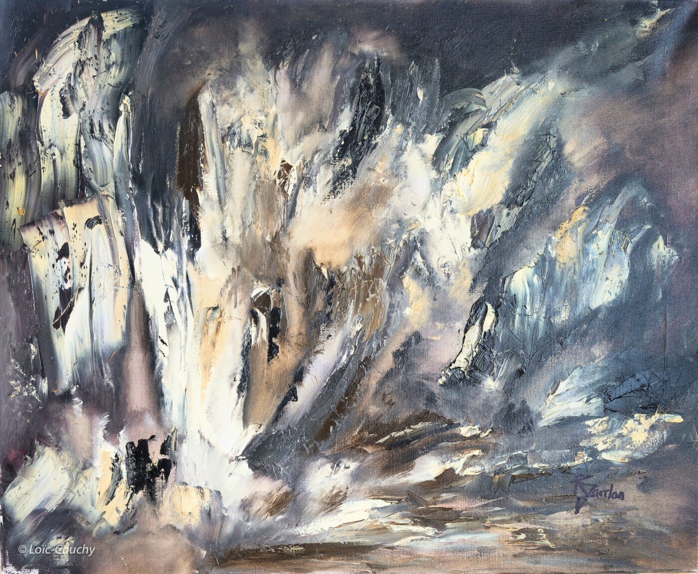
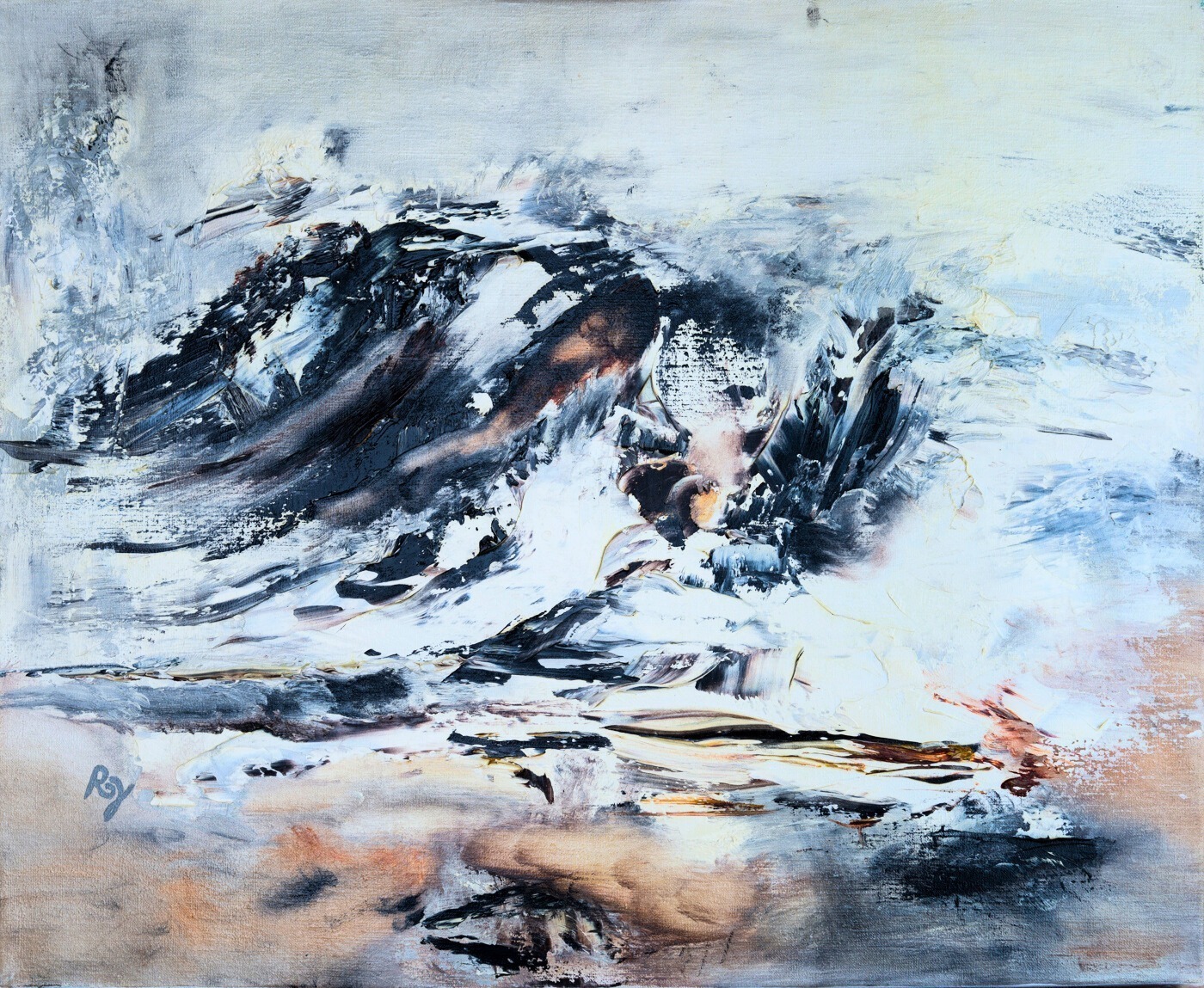
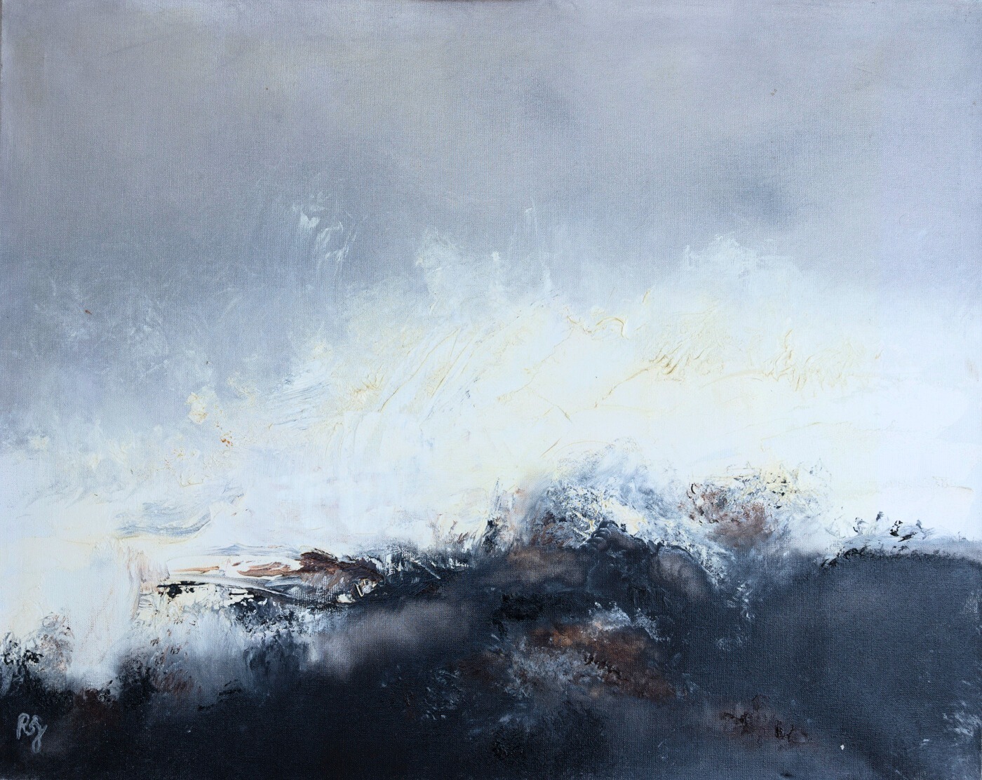
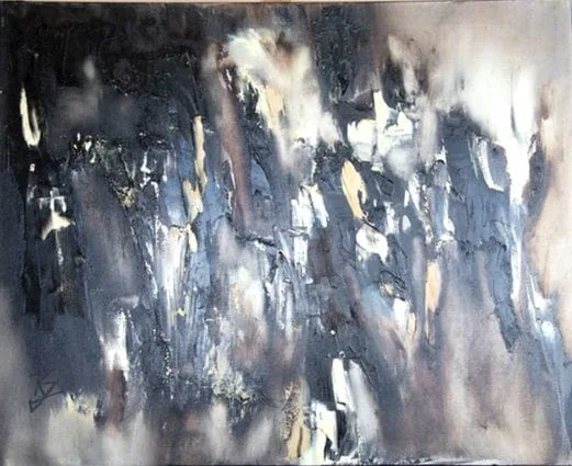
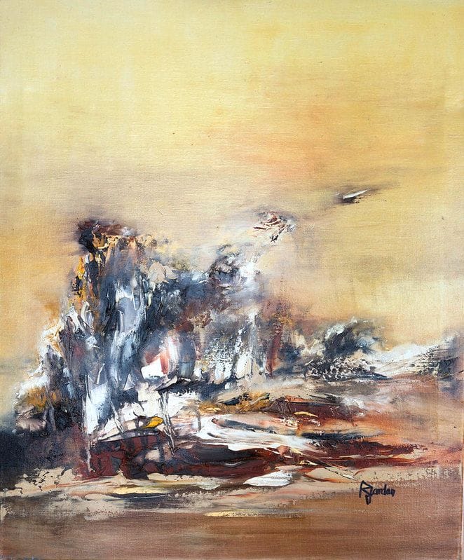
6 original works in this collection.
Sober canvases in neutral tones and restrained forms, for interiors after calm rather than effect.
See all the worksJapandi was born from the meeting of two traditions that, without knowing each other, were after the same thing: Japanese wabi-sabi, which accepts imperfection and the passing of time, and Scandinavian functionalism, which refuses the superfluous. What comes out of it is a calm interior in natural tones, where every object has a reason to be there.
In a room built that way, an over-talkative painting jars immediately. You need a work that holds the wall without raising its voice.
The works gathered here share one measurable characteristic: low saturation. Beiges, taupes, warm greys, muted greens, deep but dampened blues. No colour tries to dominate the others.
This is a particular facet of the work of Régine Gardan, who painted a great deal in bright colours, but whose canvases sometimes move towards this duller, almost mineral register. Those are the ones we have brought together. If you want more bareness still, the minimalist selection takes the logic further, and the monochrome canvases concentrate all the attention on a single shade.
Japandi prefers emptiness to filling. One canvas per wall, surrounded by space, beats three competing for attention. Vertical formats suit narrow walls and visually stretch a low-ceilinged room, while square formats bring a stability that suits this style.
Leave margin: at least twenty centimetres of bare wall on each side of the work. The guide on how to hang a painting gives heights according to the room, and the simulator lets you check proportions before drilling.
Japandi excels in the bedroom, where its restraint accompanies rest: see the bedroom canvases. It also works very well in a workspace, where neutral tones do not tire the eye over long hours.
In a living room it asks for a little more care: if the room is already very neutral, add warmth elsewhere, with a textile or with wood, so the whole does not turn cold. The living room formats will give you the right sizes.
The three styles look alike from a distance, and many sites confuse them. The distinction is clear, though, and it changes what you should be looking for.
Minimalism removes. Its aim is reduction: fewer forms, fewer colours, fewer objects. A minimalist canvas can be almost empty. See our minimalist canvases for that register.
Wabi-sabi accepts. Its aim is the trace: irregular material, passing time, imperfection owned rather than hidden. A wabi-sabi canvas usually carries more material than a minimalist one, and our wabi-sabi canvases show it well.
Japandi balances the two. It keeps the compositional rigour of minimalism but allows the warmth and material of wabi-sabi. It is the easiest of the three to live with day to day, because it does not ask you to empty the room.
The first mistake is confusing neutral with dull. A neutral palette does not rule out depth: a beige canvas with variations in material is alive, a uniform beige canvas is flat. Look at the material, not only the shade.
The second is massive black. Japandi uses black in touches, never as a dominant flat area. If you are after that clean contrast, our black and white selection will match your intention better.
This is a consistency the style holds to particularly: japandi puts authentic materials first, raw wood, ceramic, linen. A framed digital print jars there, even when the image is beautiful.
Every canvas shown here is painted in oil on cotton canvas, by hand, in a studio in Isère. The material keeps the relief of the gesture, and that is precisely what wabi-sabi calls the trace of the hand. Each work is signed and delivered with its certificate of authenticity. We explain what that really involves on our hand-painted abstract art page.
Original artwork or reproduction: what really changes
| Original artwork (oil on canvas) | Industrial reproduction | |
|---|---|---|
| Texture | Real relief of the pigments, light catches the surface differently through the day | Flat surface, identical look whatever the light |
| Uniqueness | One of a kind: a single one in the world, yours | Mass-produced, thousands of identical copies |
| Authenticity | Signed by the artist, certificate of authenticity included | No original signature, no certificate |
| Over time | Oil paint lasts for generations and can be passed on | Wears out and gets replaced like a decor item |
| What you own | The real work of an artist, with its story | A licensed printed image |
Japandi art is quiet, low-saturation work: beiges, taupes, warm greys, muted greens and dampened blues, with simple composition. No colour tries to dominate the others. It suits interiors built on restraint, where a loud painting would jar immediately against the calm the style is after.
Because it is the easiest of the pared-back styles to live with. It keeps the compositional rigour of minimalism but allows the warmth and material of wabi-sabi, so it does not require emptying the room. It also suits small spaces well, where a calm palette makes a room feel larger.
Two stand out. Confusing neutral with dull: a beige canvas with variation in its material is alive, a uniform beige one is flat, so look at the texture and not only the shade. And using black as a dominant flat area, when japandi only ever uses it in touches.
It is a proportion guide: a canvas hung above a piece of furniture should be around two thirds of its width. Above a sofa, that usually means a large format rather than the small one most people first consider. The same rule applies above a bed, a sideboard or a dining table.
Each painting is hand-painted, signed by the artist and delivered with its certificate of authenticity.
Careful, free delivery across the European Union and Switzerland, with a tracking number.
Pay securely by bank card, through the Stripe platform.
A question about an artwork or an order? We're happy to help.