16 original works in this collection.
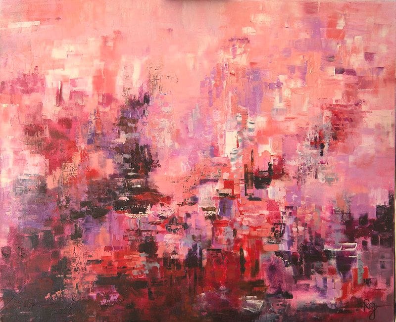
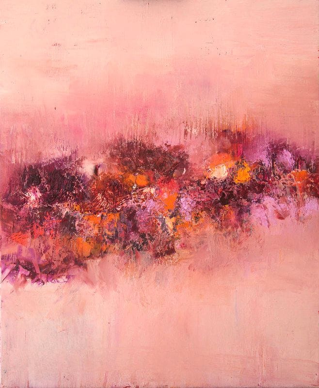
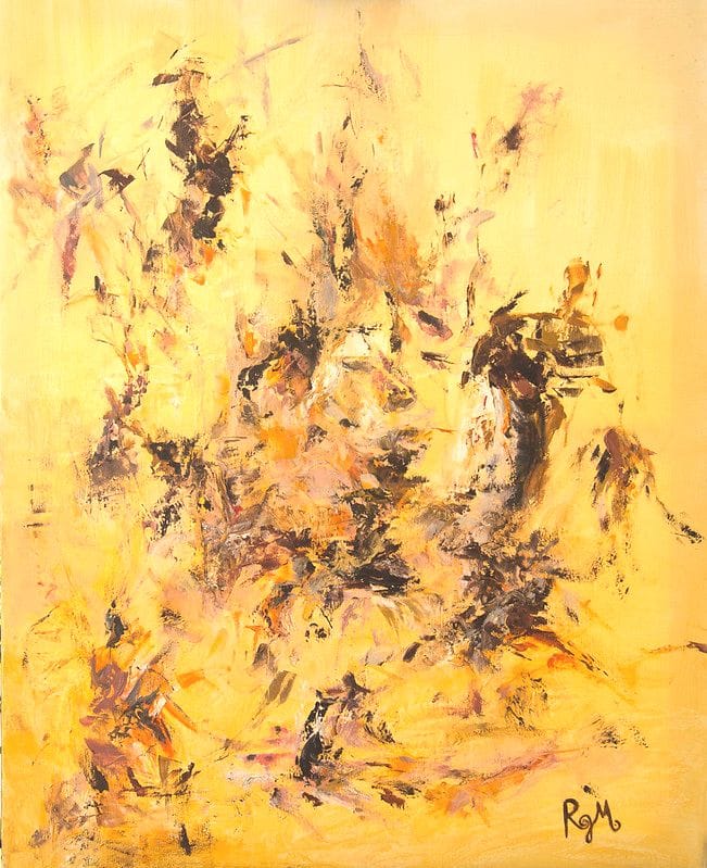
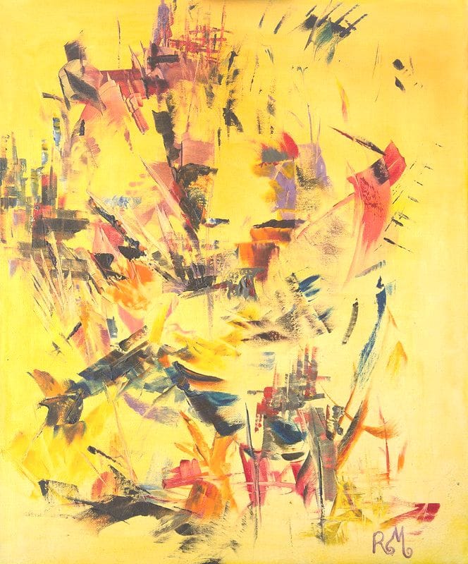
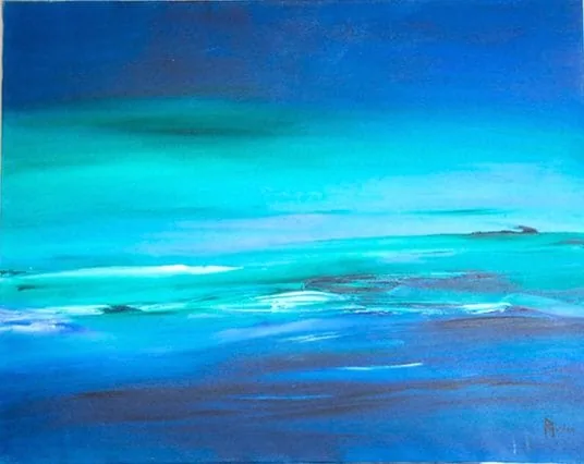
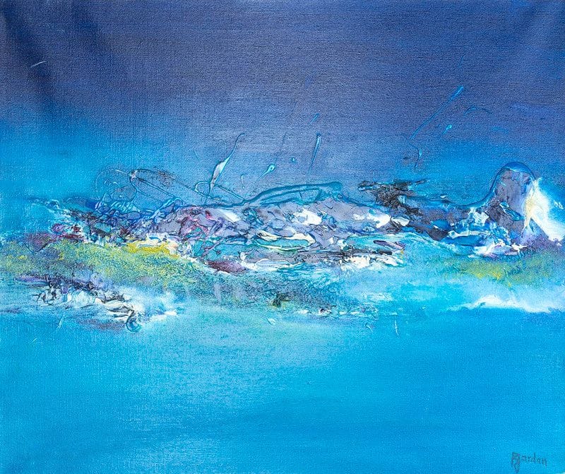
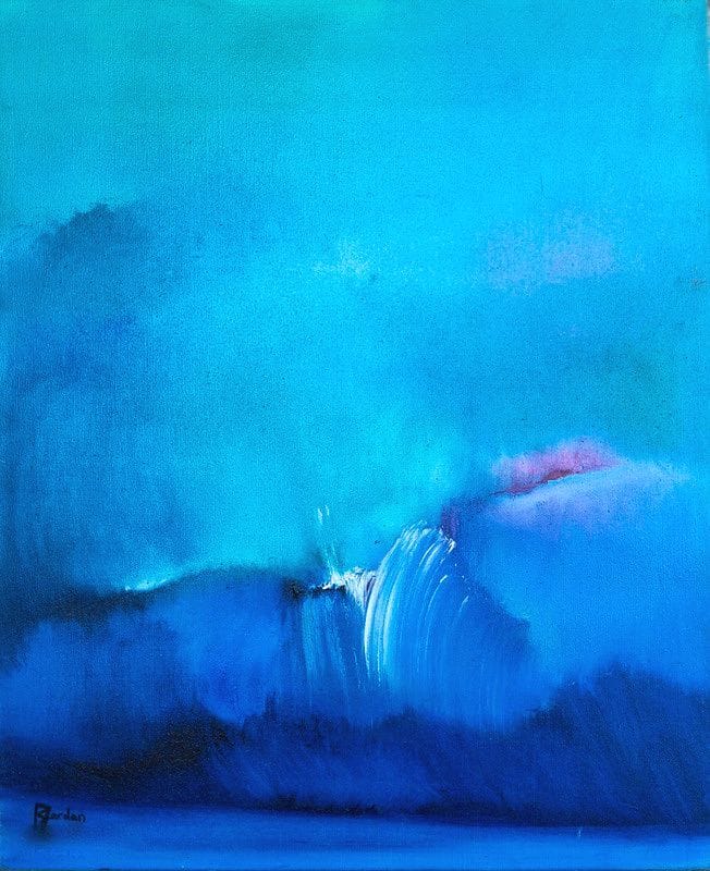
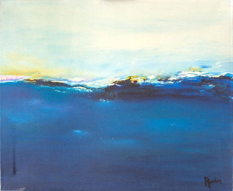
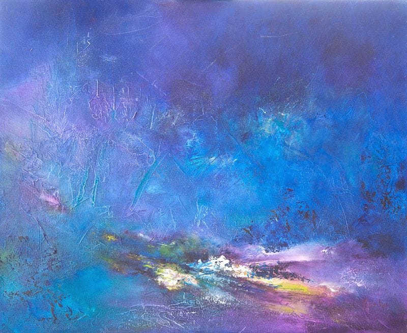
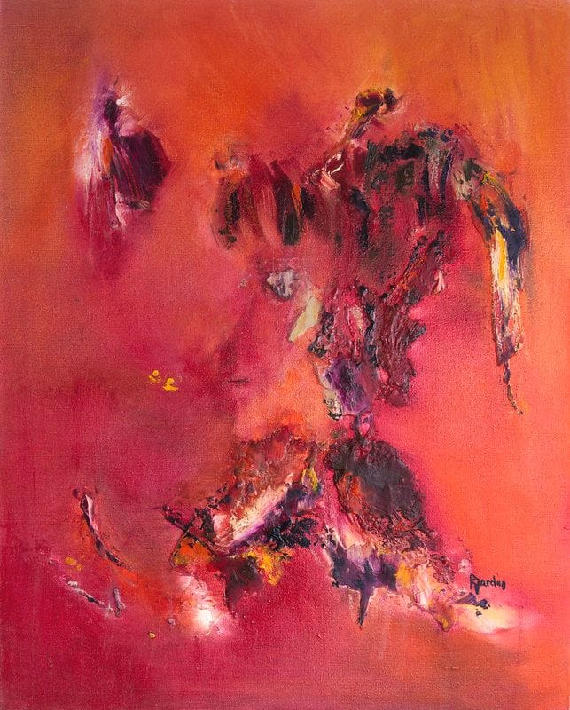
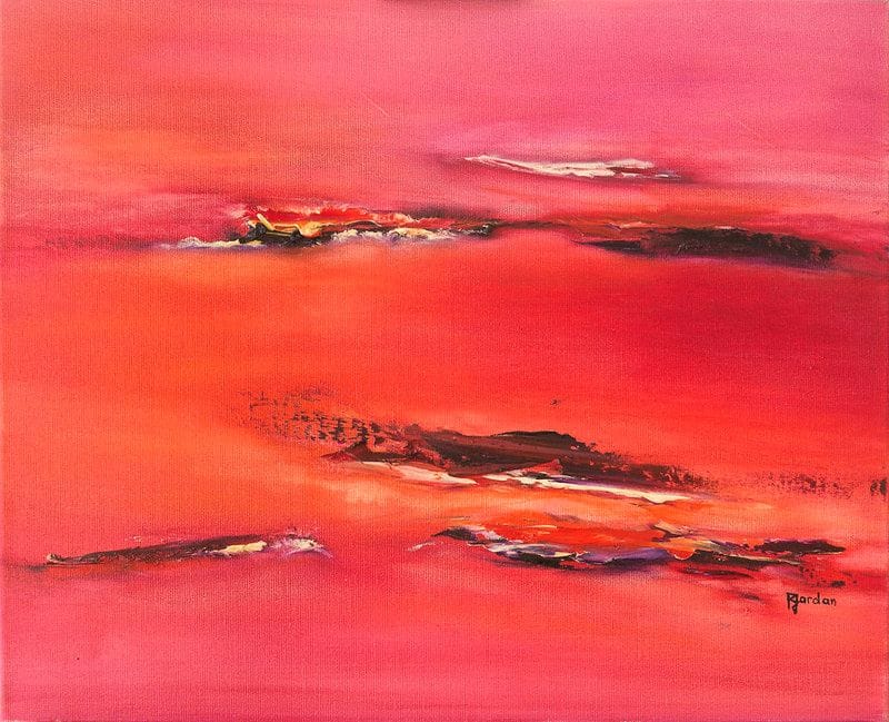
Sixteen works where a single hue unfolds in tonal shades: deep reds, ocean blues, powdery pinks, sunlit yellows, soft greens. Each canvas is unique, hand-painted in oils.
See all the worksSome colours stop you in your tracks. A deep red that warms like the end of a summer day, a blue that breathes like the sea at first light, a yellow that keeps a little sunshine inside it. A monochrome painting offers you that encounter: a single hue, unfolded through all its shades, taking its time to speak to you. This collection brings together sixteen works by Régine Gardan, each hand-painted in oils on cotton canvas, each carried by one dominant colour declined in tonal shades.
A monochrome painting explores one colour. That may sound simple. In truth, it is an adventure: when a single hue fills the whole canvas, every one of its variations becomes an event. Art history remembers the radical flat fields, like that of Yves Klein, who made a deep blue his signature. Yet monochrome also lives, perhaps above all, in tonal painting: a mother colour opening into lights, into shadows, into neighbouring vibrations.
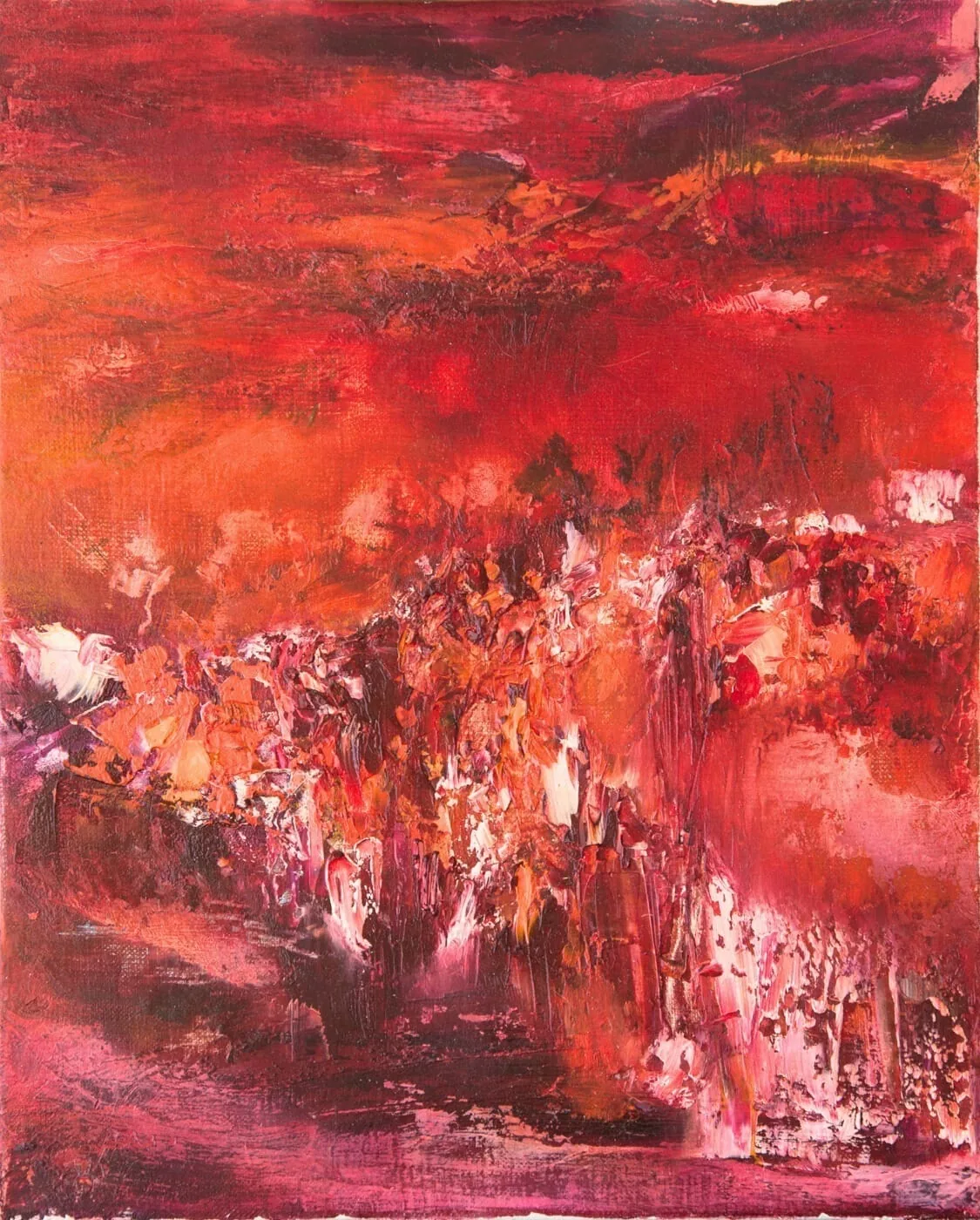
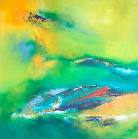
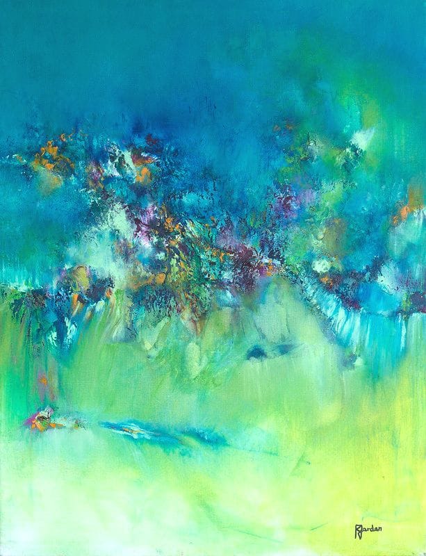
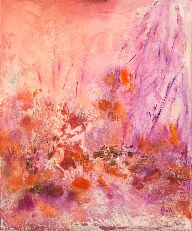
That is the path Régine Gardan chose. In her canvases, red is never just one red: it slides from garnet to vermilion, lightens into coral, deepens into an almost nocturnal purple. Blue moves from azure to ink, pink stretches from powdery to a quiet fuchsia. Pigments layer over one another, the paint thickens here and thins there, and the colour becomes a landscape in its own right. Looking at a tonal painting means stepping into the intimacy of a hue and discovering everything it can say when given all the room.
Hang a monochrome painting on a wall and watch what changes. The room gathers around it, gently, effortlessly. A multicoloured work tells several stories at once; a monochrome tells only one, and tells it fully. The colour radiates beyond the frame, tints the atmosphere, sets an emotional temperature you step into like a warm bath.
That feeling of immersion is what makes monochrome so endearing. Tonal ocean blues calm an entire room, like a window opened onto water. Deep tonal reds warm the wall and draw the eye, evening after evening. If one family of colours already calls to you, our blue abstract paintings and our red abstract paintings carry this exploration further, hue by hue.
Which colour should you invite home? Start by listening to what you want to feel. The psychology of colours has long observed it: blue slows the inner rhythm, red awakens and stimulates, green rests the eyes and the mind, yellow brightens grey days, pink wraps everything in softness.
In a bedroom, ocean blues and powdery pinks accompany sleep and slow awakenings. In a living room, a deep red or a sunlit yellow brings life to conversations and evenings. In a study, tonal greens support concentration without ever weighing on it. Think about natural light too: a north-facing room brightens with warm yellows and pinks, while a sun-drenched room can welcome blues and greens that cool it down. And if your home loves clean lines, a minimalist painting will converse naturally with a monochrome: both share the same taste for silence and space.
Step close to a canvas hand-painted in oils: the surface is alive. Brushstrokes leave a relief that catches the light differently as the day goes by. In the morning the shades look lighter, almost fresh; in the evening, under a warm lamp, the same pigments turn deep and enveloping. Thicker passages of paint cast tiny shadows, layered glazes let you glimpse the colour beneath. A hand-painted monochrome changes every day, which is why you never tire of it.
A printed reproduction stays identical to itself: the surface smooth, the colour uniform, the result fixed once and for all. In Régine Gardan's work, every piece is one of a kind. Each canvas in this collection was painted by her hands, between her studio and the art salons of Isère where her work won awards. It is signed and comes with its certificate of authenticity: you welcome an original into your home, with its history and its texture.
Give it a wall where it can breathe. Monochrome loves space: a clear, uncluttered stretch of wall, a painting hung at eye level, and the colour does the rest. You can then echo its hue in small touches: a cushion, a vase, a throw in the same family of colours, and the room finds its thread.
Do not fear contrast either. Sunlit tonal yellows on a pearl-grey wall, a deep red among natural tones: the meeting creates the spark. Take your time browsing the sixteen works in this collection and pause on the one that holds you. It is often the best guide: the colour that does you good is recognised at first sight. Shipping is free across the European Union, and every painting is carefully packed before it travels to your wall.
Each painting is hand-painted, signed by the artist and delivered with its certificate of authenticity.
Careful, free delivery across the European Union and Switzerland, with a tracking number.
Pay securely by bank card, through the Stripe platform.
A question about an artwork or an order? We're happy to help.