Colour Meanings: The Complete Guide, Colour By Colour
23 August 2026
TL;DR
- For the historian Michel Pastoureau, colour is a social fact: its meaning depends on the era and the culture.
- Pink speaks of softness, red of passion, blue of loyalty, green of hope, and yellow of joy.
- A study across 30 countries (Lausanne, 2020) finds a shared core, with exceptions: white in China, purple in Greece.
- Calming pink, seductive red and creativity-boosting blue have all failed to survive scientific replication.
Hi, I'm Théo! Among the quotations my mother had copied out by hand, there is one from Matisse: “I feel through colour, so it is through colour that my canvas will always be organised.” That is how she worked, in periods: a season of reds, one of blues, one of greens. This guide tells you what each colour means, where those meanings come from, and what historians and researchers really say about them.
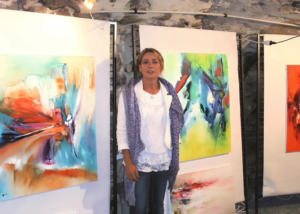
Régine Gardan
An Award-Winning Artist, 1964 - 2018
- 25+years of painting
- 200+hand-painted canvases
- 35+exhibitions
- 14awards & honours
Where Do Colour Meanings Come From?
A simple idea first, one that sheds light on everything else. For the historian Michel Pastoureau, who has devoted a series of books published by Seuil to colours (Bleu in 2000, Noir in 2008, Vert in 2013, Rouge in 2016, Jaune in 2019, Blanc in 2022), colour is first and foremost a social fact: it is society that “makes” colour, not the eye or the pigment. A meaning is therefore never written into nature. Blue is the proof: little regarded by the Greeks and Romans, who associated it with barbarian peoples, it became in the Middle Ages the colour of the Virgin's cloak and of the kings of France, and today it is the favourite colour of most Europeans. The retina has not changed. The way we look has.
Two other sources run through this guide. The sociologist Eva Heller surveyed around 2,000 people in Germany at the end of the 1980s: her book Psychologie de la couleur (Pyramyd, 2009) catalogues the feelings people spontaneously associate with each shade. It is a self-report survey: it tells you what a population shares at a given moment. More recently, a team from the University of Lausanne (Jonauskaite, Mohr and their colleagues, Psychological Science, 2020) put the same question to 4,598 people in 30 countries: colour-emotion associations look very much alike from one country to the next, with genuine local variations that you will find further down.
And what about the science of effects? The landmark review by Elliot and Maier (Annual Review of Psychology, 2014) concludes that colour can genuinely influence our emotions, our reasoning and our behaviour, but that this body of research is still in its infancy: the effects depend heavily on context, and several celebrated results fell apart when they were repeated. In this guide you will see, colour by colour, what holds up and what does not. It is the follow-up to our article on colour psychology, this time with the sources.
Summary Table: The Meaning Of Each Colour
For those in a hurry, it is all here. The detail and the sources follow, colour by colour.
| Colour | What it means in the West | Its flip side | At home in |
|---|---|---|---|
| Pink | Softness, tenderness, romance, love | Naivety, sentimentality | Bedroom, reading nook |
| Red | Love, passion, energy, power | Anger, danger, prohibition | Living room, dining room |
| Orange | Fun, sociability, warmth | Rarely a favourite colour | Kitchen, living space |
| Yellow | Joy, optimism, light | Jealousy, envy, betrayal | Hallway, dark room |
| Green | Nature, hope, luck, freshness | Poison, fickleness | Home office, living room, bedroom |
| Blue | Calm, loyalty, trust, depth | Coldness, melancholy | Bedroom, home office |
| Purple | Spirituality, waiting, extravagance | Mourning, ambiguity | In touches, anywhere |
| Black | Elegance, strength, mystery | Mourning, fear, endings | Living room, home office, as contrast |
| White | Purity, peace, beginnings, cleanliness | Mourning (in Asia), emptiness | Anywhere, as breathing space |
| Brown | Comfort, security, humility, earth | The least-loved colour | Living room, dining room |
Meaning Of The Colour Pink
Pink is the colour whose meaning people look up most, and it is also the one whose history is most surprising. In the seventh volume of his series, Rose (Seuil, 2024), Michel Pastoureau shows that it was a late creation: rare in European objects before the fourteenth century, it spread into clothing at the end of the Middle Ages thanks to an imported dye, brazilwood. For a long time it did not even have a name of its own: it was the flower that ended up christening it, when the horticulturists of the eighteenth century managed to breed pink roses. That is when it became romantic and soft.
Today, in Eva Heller's survey, pink is first and foremost the colour of softness, daydreaming and tenderness, and the Lausanne study ranks the pink-love association among the strongest of all, across every nation. Its feminine side, on the other hand, is recent: the dress historian Jo B. Paoletti has shown that in the early twentieth century, in the United States, pink was sometimes recommended for boys and blue for girls. The reverse only became established in the middle of the century.
One famous idea to shelve: the “pink that calms aggression”, born of an observation in a Seattle prison in 1979. A controlled experiment carried out in real detention cells (Genschow and colleagues, 2015) found no effect at all.
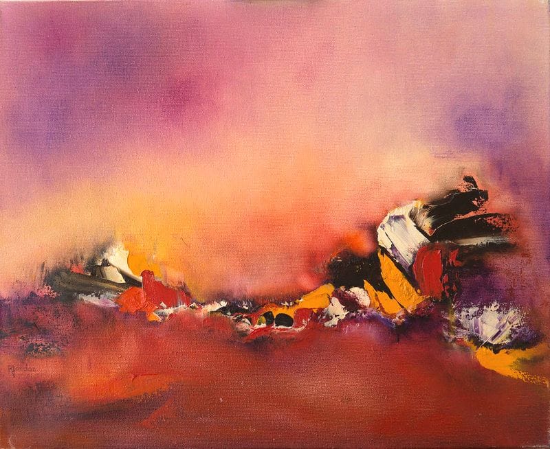
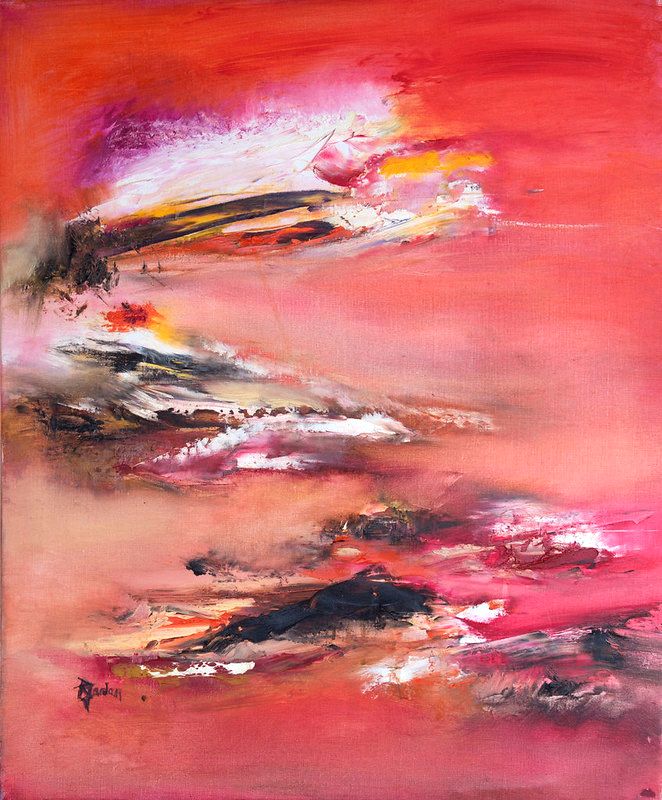
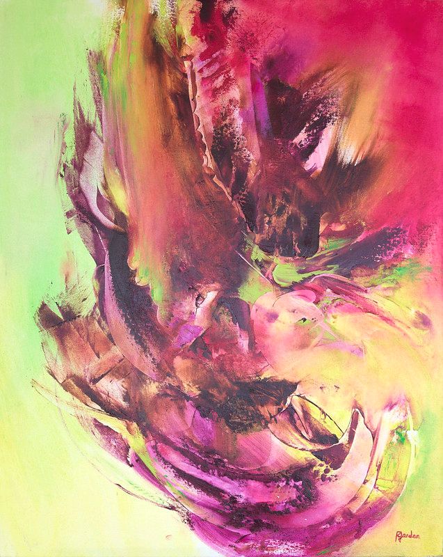
“Amour” (60 × 50 cm) keeps pink on the warm side: coral, oranges, a mauve sky coming down onto a dark line. On the wall, pink warms a bedroom without weighing it down; our article why hang a pink abstract painting sets out the pairings that work, and the collection of pink paintings shows every shade my mother drew from it.
Meaning Of The Colour Red
For Pastoureau (Rouge, Seuil, 2016), red is the first colour human beings learnt to make and master, in painting as in dyeing, and for a long time it remained “the colour par excellence”. Its history is a string of contradictions: a sign of power in antiquity, in the Middle Ages it evoked both the blood of Christ and the flames of hell, before being judged indecent by the moralists of the sixteenth century, and then becoming, after the French Revolution, the colour of the forces of progress and of the workers' movement.
That ambivalence has not gone away. The chapter Eva Heller devotes to red is entitled “not only love, but hate too”: it is the colour of every passion. The Lausanne study makes it the most ambivalent colour in the world, associated, across every nation, with both love and anger.
As for measured effects, one thing holds up and another does not. At the 2004 Olympic Games, in four combat sports where the colour of the outfit is assigned at random, athletes in red won significantly more than half of their bouts (Hill and Barton, Nature, 2005): an effect measured in competition, not an all-purpose power. By contrast, the “red that makes you attractive” has not survived replication: a 2018 meta-analysis, co-authored by the author of the original study, concludes that the effect may be very small, or even non-existent in real-world conditions.
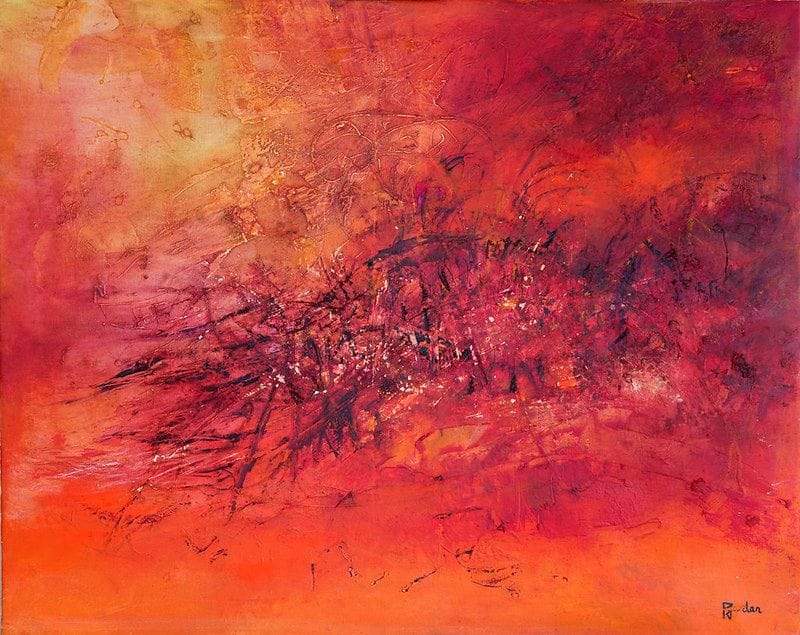
“Trou Noir” (80 × 65 cm) is a red that makes no apologies: carmine, orange, and a surface scored with a palette knife that catches the light. It is the largest collection in the catalogue, the red abstract paintings, and it is the colour that wakes up a living room or a dining room that is too well-behaved. To get the dose right without letting it take over, read why hang a red abstract painting.
Meaning Of The Colour Orange
Orange has only had a name since the fruit arrived in the West: Pastoureau points out that the word “orangé”, derived from the fruit imported from the East, appears at the end of the fourteenth century, and that it is only attested as the name of a colour in 1553, according to the Dictionnaire historique de la langue française. Before that, these tones were called red, yellow, russet or brown. A mixed colour, long considered impure by a medieval society that valued only pure colours, it rose in esteem once it was dyed with saffron, a rare product reserved for precious textiles: orange then became exotic, rich and sunny.
For Eva Heller, orange is the colour of fun, sociability and cheerfulness, and the Lausanne study links it to joy and amusement among its strongest associations, without noting any national exception, whereas it flags some for yellow and white. The paradox: it is at the same time one of the colours least often named as a favourite. We like it in a room, less so on ourselves. In the Netherlands, where it is the colour of the House of Orange-Nassau, it has become the colour of national pride, from the king to the sports teams.
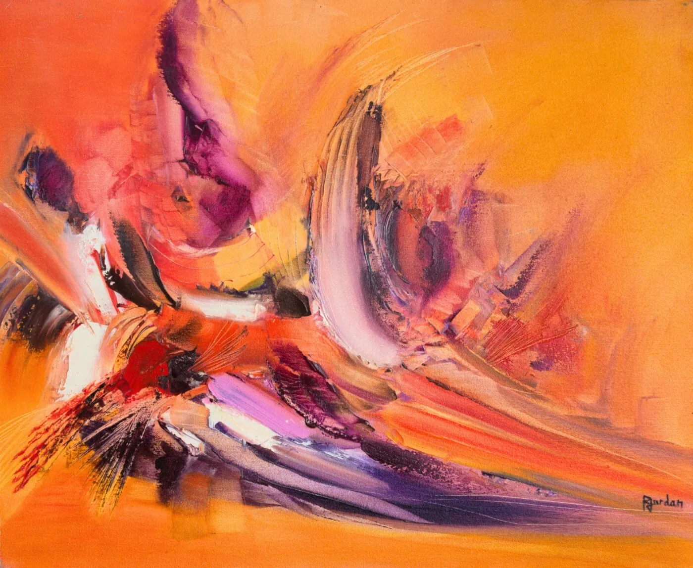
“Perroquet” (60 × 50 cm) carries that very orange: bright, joyful, broken up by whites and a few touches of purple that stop it from becoming mere decoration. It is a colour for the kitchen and the living space, where you entertain; you will find it in the red collection, where my mother filed her oranges.
Meaning Of The Colour Yellow
Yellow is the colour that has fallen furthest in Western esteem. Pastoureau (Jaune, Seuil, 2019) shows that it was prized in antiquity, associated with light and even with immortality, before losing its value in the Middle Ages: gold kept the positive aspects (wealth, the sacred), while ordinary yellow inherited the negative ones. From the twelfth century onwards, it became the colour of traitors: Judas is painted in a yellow robe, and the badge imposed on Jews from the thirteenth century was most often yellow. It was sport that rehabilitated it in the twentieth century, with the yellow jersey of the Tour de France, created in 1919 and coloured like the paper of the newspaper L'Auto.
In Eva Heller's survey, yellow remains contradictory: optimism, joy and fun on one side, jealousy, envy and lies on the other, and it is rarely named as a favourite colour. Yet yellow-joy is among the strongest associations in the Lausanne study. With one caveat: yellow is, along with purple, the colour whose associations vary most from one country to another, and the Egyptian participants alone did not associate it with joy. Another study by the same team, on 6,625 people in 55 countries (2019), shows that the further you live from the equator and the more it rains, the more you associate yellow with joy. The sun is only worth something because of the grey weather.
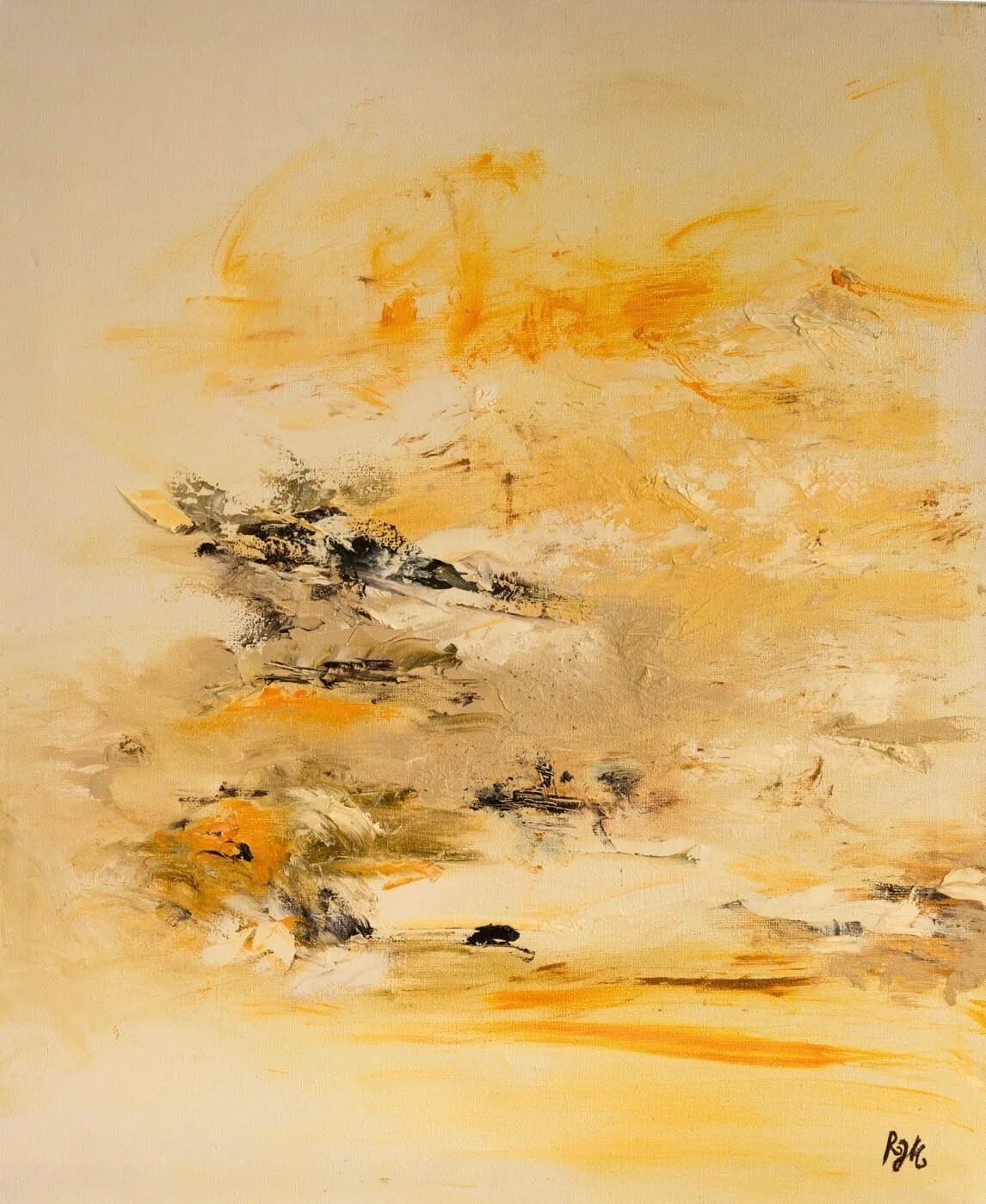
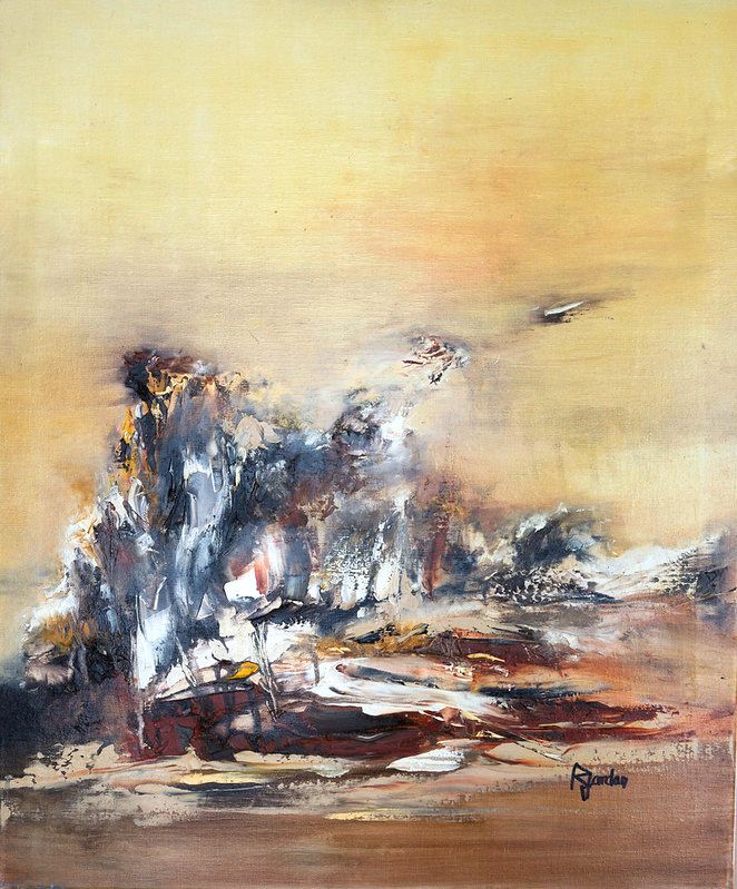
“Coucher De Soleil” (60 × 73 cm) is a golden, almost sandy yellow, which does what yellow does best at home: bring light where it is lacking, a hallway, a corridor, a north-facing room. The collection of yellow paintings runs from lemon to honey, and why hang a yellow abstract painting explains where to put it.
Meaning Of The Colour Green
Green owes part of its meaning to chemistry. For centuries, Pastoureau recounts (Vert, Seuil, 2013), its dye was unstable and hard to fix: it was therefore associated with everything that changes, childhood, love, luck, games, chance, money. Hence its deep ambivalence: the colour of life, sap and hope, but also of poison, misfortune and the Devil. And contrary to intuition, green only became the colour of nature for good in the Romantic era, before becoming the colour of health, and then of ecology. The West now entrusts it, Pastoureau writes, with “the impossible mission of saving the planet”.
In Eva Heller's survey, green is the third favourite colour, behind blue and red; she describes it as “between hope and poison”, soothing, tied to spring. Elsewhere, it is sacred: Pastoureau reports the tradition according to which the Prophet had a particular fondness for green, which became the colour of his descendants and then of Islam. In the laboratory, a series of four experiments (Lichtenfeld, Elliot and their colleagues, 2012) found that a brief exposure to green improved performance on a creativity task: a modest effect, which the authors themselves ask us not to over-interpret.
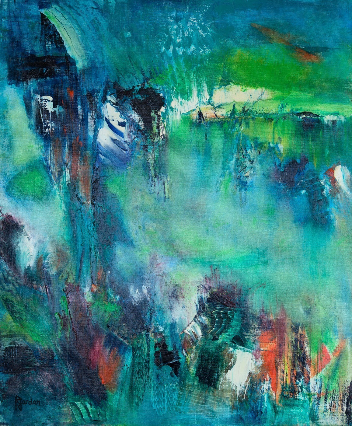
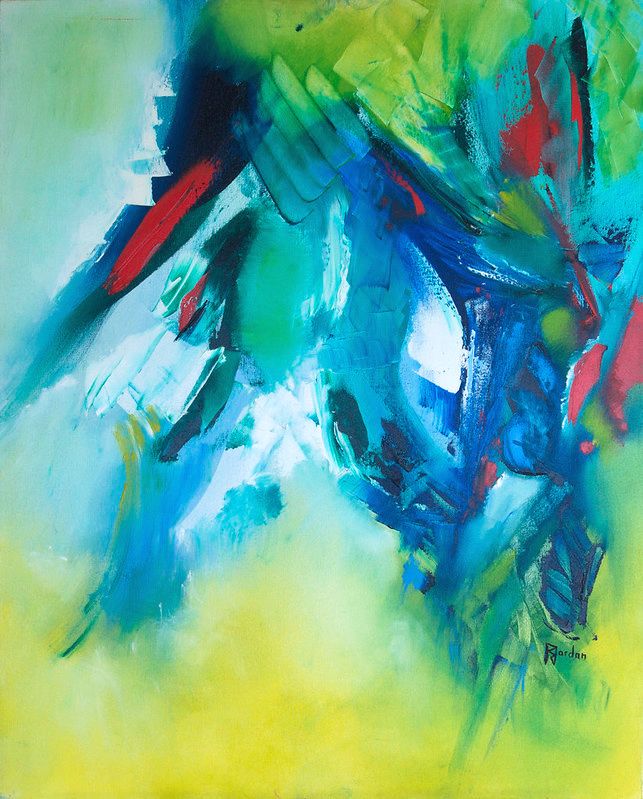
“Lac De Jungle” (60 × 73 cm) is a deep, leafy green, crossed with turquoise and a few flashes of red. It is the colour you put in a home office to breathe, or in a living room to let the outdoors in: the collection of green paintings and the article why hang a green abstract painting will help you choose the shade.
Meaning Of The Colour Blue
You read it above: blue has come a long way. Pastoureau (Bleu, Seuil, 2000) shows that the Greeks and Romans had no real word for it and regarded it as a barbarian colour. Everything changed in the twelfth and thirteenth centuries: it became the colour of the Virgin's cloak, of stained glass, and then of the kings of France with their azure strewn with fleurs-de-lis. From there, it never came down again. Asked about the polls, Pastoureau points out that more than half of Westerners name it as their favourite colour, far ahead of green.
Eva Heller makes it the colour of loyalty and trust; her chapter is entitled “eternal as fidelity”. It is the colour you choose when you want calm and depth. One nuance, though, on the effects: the study claiming that a blue background fosters creativity and a red one favours detail-oriented tasks (Science, 2009) has not held up: a direct replication of their first experiment, run with nearly four times as many participants (Steele, 2014), did not find the effect, and the creativity experiments themselves have never been replicated. And language itself shapes blue: a study published in PNAS in 2007 shows that Russian speakers, who have two basic words for light blue and dark blue, are quicker to tell apart two blues lying on either side of that boundary.
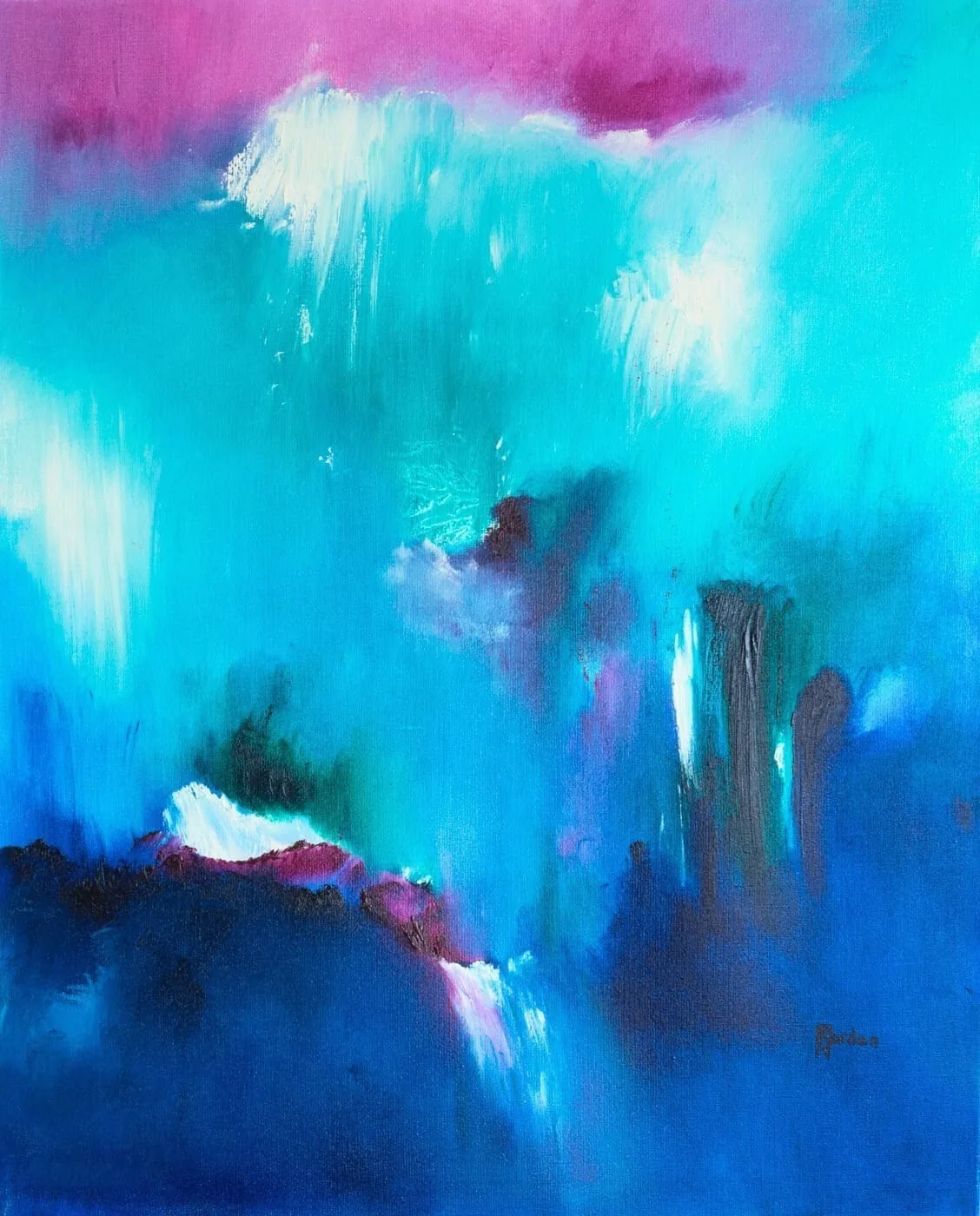
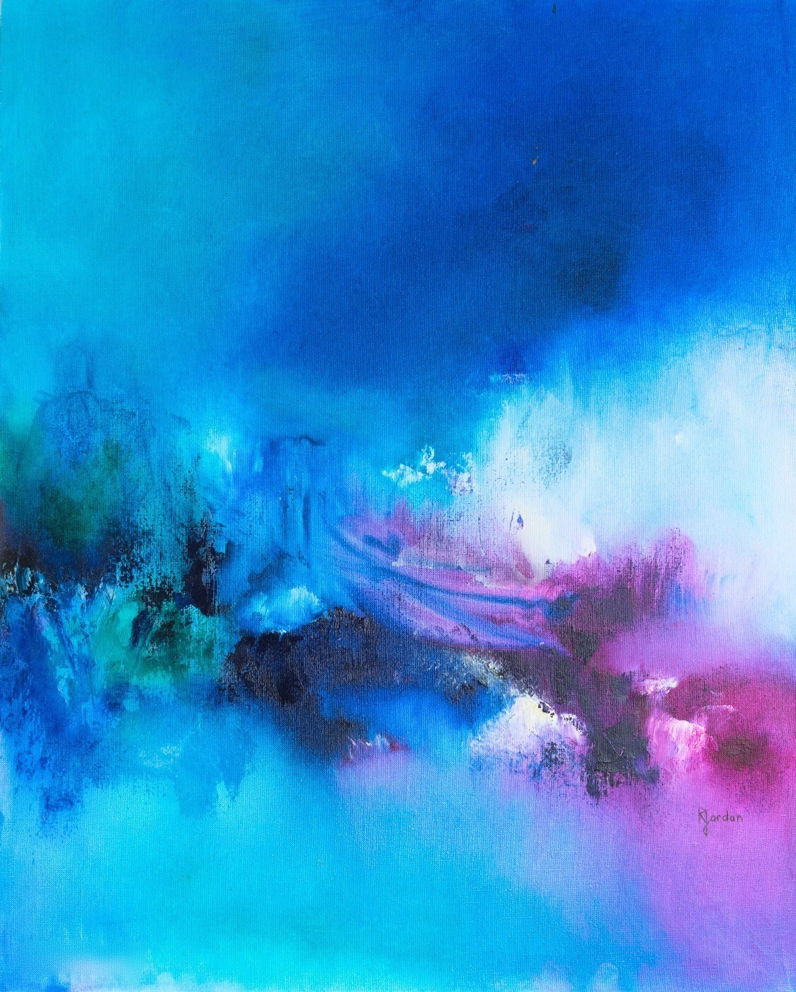
“Douceur” (65 × 80 cm) lives up to its name: turquoise, deep blue, white veils drifting across. It is the blue of a bedroom where you want to sleep, or of a home office where you want to settle. The blue abstract paintings are the second-largest collection in the catalogue, and why hang a blue abstract painting tells you what to pair it with.
Meaning Of The Colour Purple
In the Middle Ages, purple was not a mixture of red and blue: Pastoureau explains that it was perceived as a “sub-black”, its most frequent Latin name being subniger, half-black. It is on that basis that it became the colour of half-mourning, and that the kings of France wore it as a sign of mourning. The Catholic liturgy has kept a trace of this: the Roman Missal prescribes it for Advent and Lent, seasons of waiting and penance. Then, in 1856, an 18-year-old student, William Perkin, was trying to synthesise quinine and discovered mauveine by accident, the first synthetic dye in history: purple, until then prohibitively expensive, became affordable and set off a genuine craze in Victorian fashion.
In Eva Heller's survey, purple is the colour most associated with vanity, extravagance, individualism and ambiguity. And it is, along with yellow, the colour whose associations vary most from one country to another: the Lausanne study notes that in Greece, where dark purple is linked to mourning in the Orthodox Church, it is associated with sadness.
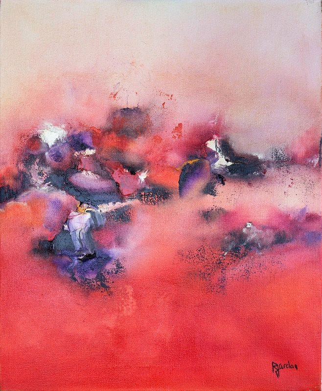
In my mother's canvases, purple is never dominant: it comes through in touches, as in “Pensées” (50 × 60 cm), where it surfaces in a coral sky. That is probably the best way to welcome it into your home: as an accent, in a multicoloured or pink canvas, rather than as a flat expanse.
Meaning Of The Colour Black
Black was excluded from the world of colours for nearly three centuries. Pastoureau (Noir, Seuil, 2008) traces how printing, the engraved image, the Protestant Reformation and then Newton's discovery of the spectrum pushed it out of the realm of colours, before the twentieth century, with art leading the way, restored its status. Latin already distinguished two blacks: niger, shiny black, and ater, matt black, the origin of the word “atrocious”.
For Eva Heller, black combines the extremes: the colour most often named for mourning, endings, secrets and strength, but also for elegance. The Lausanne study confirms this weight: in every country, black and red are judged the colours most charged with emotion, and the black-sadness and black-fear pairs are among the strongest associations. A study that became famous (Frank and Gilovich, 1988) had observed that teams in black jerseys were among the most penalised in the American football and hockey leagues; the effect has been debated ever since, with a 2011 reanalysis failing to find it in hockey.
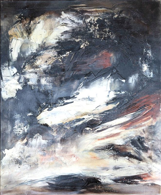
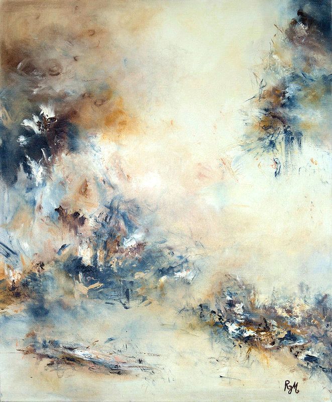
“Mer De Glace” (60 × 73 cm) shows black as my mother worked it: never alone, always crossed with white, with a hint of ochre. It is the elegant black, the one that gives a light-filled living room its structure. The black and white collection and the article why hang a black and white abstract painting cover the subject in full.
Meaning Of The Colour White
White is a colour in its own right, and Pastoureau (Blanc, Seuil, 2022) reminds us that this status was never disputed before the seventeenth century: it was Newton's splitting of light that pushed it out of the order of colours. Its Western symbolism is markedly more positive than negative: purity, innocence, wisdom, peace, cleanliness and, from the eighteenth century, hygiene and health. But it has also been the colour of mourning, in the West itself: the queens of France wore mourning in white until the sixteenth century.
In Eva Heller's survey, almost no negative concept attaches to white, which she places on the side of beginnings and the ideal; yet it is the favourite colour of only 2% of respondents, and just 1% name it as their least-liked colour. An experiment by Sherman and Clore (Psychological Science, 2009) even showed that words linked to morality are recognised faster when written in white, and immoral words when written in black: a laboratory effect, not to be over-interpreted. And the cultural exception is clear: in the Lausanne study, Chinese respondents associate white with sadness far more than the others, in connection with the white garments worn at funerals.
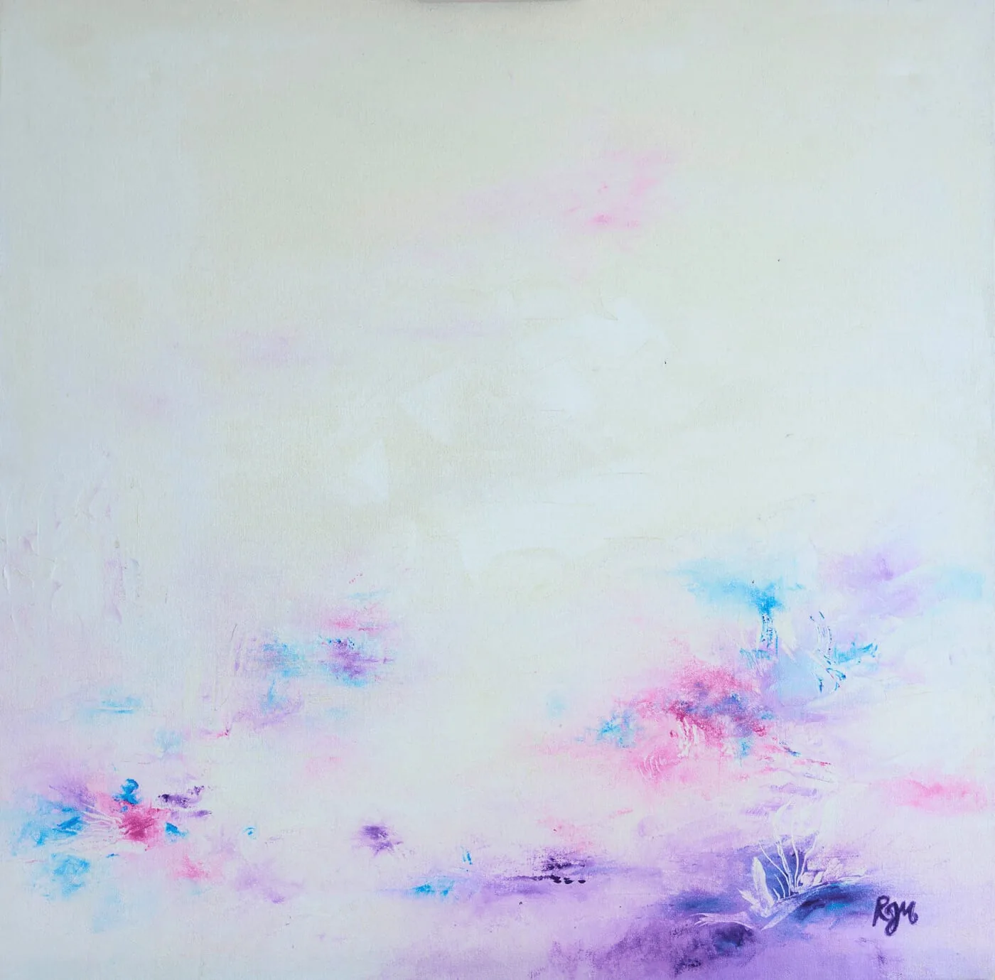
“Mami” (60 × 60 cm) is almost entirely white, with pink and blue touches rising from the bottom. White on the wall is breathing space: it serves busy rooms and small spaces, and it leaves room for the other colours. You will find it in the pink collection.
Meaning Of The Colour Brown
Brown is, for Pastoureau, “of our eleven colours and half-colours, the least loved, even though it abounds in nature, in soils, in plants”. The French word for it, marron, comes from the Italian marrone, the large chestnut: it referred to the fruit from 1526 and only became the name of a colour in the eighteenth century, according to the CNRS dictionary. In the Middle Ages, though, brown was a chosen colour: the Franciscans adopted an undyed habit, ranging from brown to grey, out of a desire to return to poverty, to set themselves apart from the black of the Benedictines and the white of the Cistercians. Pastoureau himself notes that brown has hardly any positive aspect “unless you regard humility and poverty as virtues”.
In Eva Heller's survey, brown tops the list of least-liked colours. But she notes a paradox that will interest everyone here: it is everywhere in interior decoration, because it carries the cosy comfort and the sense of security of home. The Lausanne study describes it differently: of all the colours tested, it is the one that triggers the fewest emotional associations. A mute colour rather than a negative one, and that is precisely what makes it easy to live with.
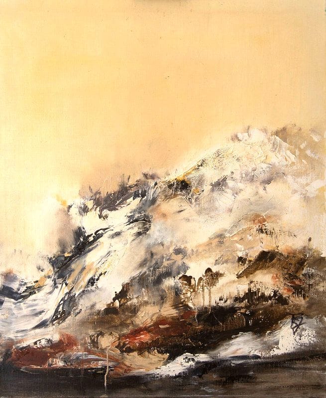
“Forêt Noire” (60 × 73 cm) is a canvas of earth: ochres, browns, whites in relief. It goes with the wood, linen and leather of a living room, where a red or a blue would demand to be listened to. My mother filed her ochres with the yellow paintings.
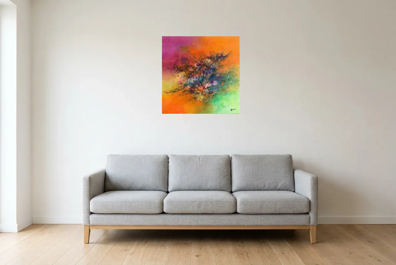
“Régine Gardan's paintings are a true symphony of colours that take us to the very depths of our being. Our soul is moved...”
Frequently Asked Questions
Which Colour Symbolises Love?
Red, first, with pink just behind. In the international Lausanne study, the red-love and pink-love pairs are among the strongest associations, across every nation. The difference lies in intensity: red also carries anger and passion, pink tenderness and softness.
What Is The Most Calming Colour?
Blue is the colour Westerners most widely prefer, and Eva Heller makes it the colour of trust; green is described as soothing in the same survey. These are shared associations, not guaranteed effects: the review by Elliot and Maier reminds us that a colour's effect depends on the room, the light and the person.
Are Colour Meanings The Same Everywhere?
Largely, with clear exceptions. The Lausanne study finds a common core across 30 countries, but white is linked to sadness in China, purple in Greece, and the Egyptian participants do not associate yellow with joy. For Pastoureau, a meaning always depends on the era and the culture that produce it.
How Do You Choose The Colour Of A Painting For Your Home?
Start from what you want to feel in the room, then from what is already there. A bedroom calls for blue, pink or green; a living room can take red, yellow and black as contrast. Our guide to choosing a painting according to your personality comes at the question from the other end: you, rather than the wall.
Choosing Your Colour, And Seeing It At Home
A meaning cannot be ordered up: you feel it in front of the canvas, or you don't. Browse the collection, more than two hundred original hand-painted canvases, sorted by colour, from pink to black and white. And if a colour speaks to you without your knowing why, our article on feng shui colours for the living room will give you another framework for placing it.