Cosy Living Room: The Colours, Light And Textures That Really Warm A Room
23 August 2026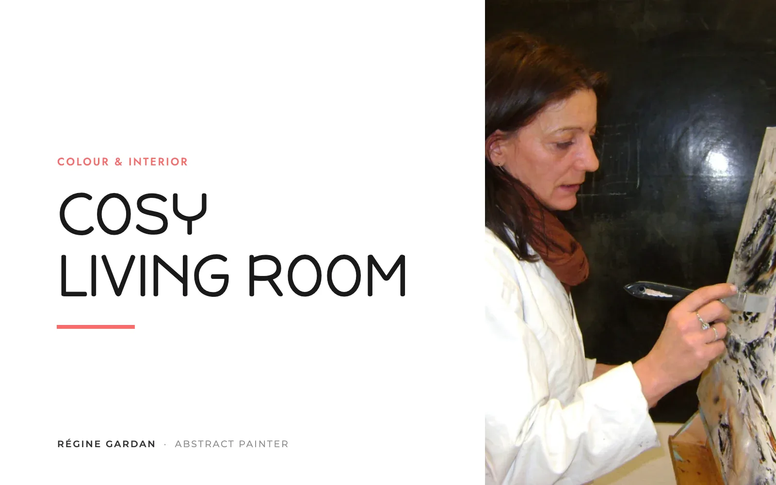
TL;DR
- The word cocooning comes from Faith Popcorn (1981); Meik Wiking's hygge gives the Danish recipe (2016).
- Earthy tones (tobacco brown, ochre, warm yellows) warm a living room; pale greys and cold whites cool it down.
- Ambient light between 2,700 and 3,000 K, several sources placed low; hygge sits around 1,800 K.
- An artwork on the wall helps cocoon the room, designers say; a bare wall is part of what cools it.
Hi, I'm Théo! At one of my mother's private views, Loïc Cauchy described her canvases like this: “Other times we grow calm, and with a cup of tea we go on dreaming a little, we contemplate the mists.” It is the best definition of a cosy living room I know, and it is talking about a painting. Here is what designers and researchers say about a room you want to stay in.

Régine Gardan
An Award-Winning Artist, 1964 - 2018
- 25+years of painting
- 200+hand-painted canvases
- 35+exhibitions
- 14awards & honours
Cocooning, Hygge: Where These Words Come From
The word “cocooning” was coined by the American futurist Faith Popcorn, who herself dates its creation to 1981, before formalising it in The Popcorn Report (1991). Merriam-Webster places the first written use in English in 1986; in French, the Usito dictionary records it in 1988 in Le Monde, and Larousse defines it as “taking pleasure in snug comfort”. Forty years on, the word has not changed, and the zen and calming paintings we are asked for most often are its wall-hung version.
Danish hygge reached our living rooms later. Meik Wiking, director of the Happiness Research Institute in Copenhagen, devoted The Little Book of Hygge (2016) to it. He writes there that slow, organic movements and dark, natural colours are “hyggelige”, whereas a bright, sterile hospital is not; when it comes to touch, he sets wood, warm ceramics and reindeer skin against steel, glass and plastic. And every home, in his view, needs a “hyggekrog”, a snug nook to curl up in.
The Colours That Warm A Living Room
According to the designer Tori Young (HollandGreen), quoted by Livingetc in February 2026, colour “sets the emotional temperature” of a living room: pale greys and icy whites turn unflattering as the light shifts through the day, whereas earthy tones, tobacco brown, whites tinged with grey-green and warm yellows give an immediate feeling of comfort.
Brown deserves a caveat, and it comes from the sociologist Eva Heller. In her survey (Psychology of Colour, French edition, Pyramyd, 2009), the chapter on brown opens with the finding that it is, of all colours, the most disliked; one section is nonetheless titled “snug comfort and security”. Both are true: brown envelops, and it bores when left on its own. A living room of beiges and browns therefore gains from a touch of bold colour somewhere, and a canvas is the simplest way to add it without repainting. What each colour brings is set out in our guide to the meaning of colours.

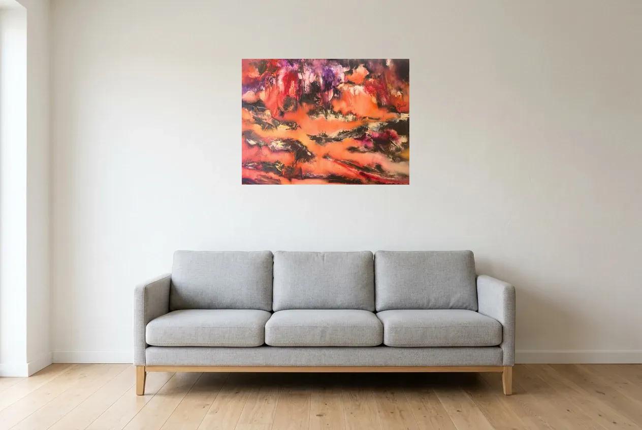
“Feu De Camp” (60 × 60 cm) is exactly that palette: sand, ochre, a few blacks, on a cream background. A canvas that warms without shouting, in the spirit of the collection of yellow paintings, where my mother kept her ochres.
“I ordered a canvas and the result is magnificent. A unique piece that perfectly enhances my home.”
Light: Low, Warm And Layered
Meik Wiking puts the “sweet spot” of hygge light at around 1,800 kelvin, the colour temperature of a sunset, a log fire or a candle, and lays down the rule: the lower the colour temperature, the more hygge it is. His institute reports that when asked “what do you associate with hygge”, 85% of Danes name candles.
For a light bulb, the interior designer Artem Kropovinsky (Arsight studio, New York), quoted by Homes & Gardens in January 2023, recommends a warm white between 2,700 and 3,000 K for ambient light; in the same article, Robert Soler (BIOS, who holds a doctorate in neuroscience) gives the reference points: 2,200 K for a campfire, 2,700 K for an incandescent bulb, 5,000 K for daylight. And according to Jo Plant, creative director at Pooky, quoted by Livingetc in February 2026, the key is to layer the sources (ceiling light, wall lights, table lamps, floor lamps) rather than switching on a single one: a light placed low feels more intimate straight away, and a linen or silk shade softens it further still.
What science adds, with caution. A study published in PLOS ONE (Kuijsters and colleagues, 2015) compared, in older adults after an anxiety-inducing film, a “cosy” setting (2,700 K, 120 lux, orange accents) with a neutral one (3,400 K, 150 lux): the group in warm light reported more pleasure and showed lower skin conductance, a sign of reduced arousal. A sample of seniors, in a laboratory: the effect does not transfer as it stands to your living room. And the famous “Kruithof curve” (1941), often cited to claim that dim light is only pleasant when it is warm, rests on almost no published data: the systematic review by Steve Fotios (University of Sheffield, LEUKOS, 2017) concludes that the credible studies do not support it. What remains solid is simple: avoid light levels that are too low, and choose warmth because you like it.
Textures, And The Nook
Hygge is touched as much as it is looked at: wood, ceramics, wool, linen, leather, according to Meik Wiking. The throw and the rug take care of the floor and the seating; heavy curtains take care of the evening. My mother's canvases are painted in oils with a palette knife, in relief: the paint itself is one more texture under low light. And the “hyggekrog”, the nook, often comes down to a lamp placed low, an armchair turned towards the room rather than the screen, and a wall with something to look at; a small format is enough in a nook.
The Canvas That “Cocoons” The Room
That is the word used by the designer Sean Symington, quoted by Homes & Gardens in August 2022: a hung artwork does not just bring character and depth, it “helps cocoon the room” and makes it welcoming. In Livingetc (February 2026), the designer Jessica Hobson lists bare walls among the mistakes that make a living room feel cold, and recommends either a gallery wall of collected pieces or a single large work for “a big wow factor”.

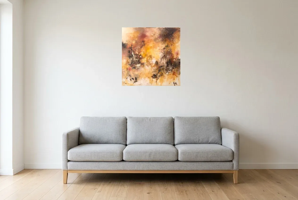
“Fossile” (60 × 60 cm) is warmer still: orange, ochre, a surface scored with the knife that catches the low light of a lamp. In a living room of neutral tones, it is the bold touch Eva Heller's survey talks about; it comes from the collection of red paintings, and the page on abstract paintings for the living room says where to hang it.
Frequently Asked Questions
What Colour Works For A Cosy Living Room?
Earthy tones: tobacco brown, ochre, sand, terracotta, warm whites, according to the designer Tori Young (Livingetc, 2026). Pale greys and cold whites turn unflattering as the light fades. A touch of bold colour, on a canvas for instance, stops the browns from becoming dull.
What Lighting Makes A Living Room Feel Warm?
Warm white bulbs between 2,700 and 3,000 K for ambience (Artem Kropovinsky, Homes & Gardens), several layered sources placed low rather than a single ceiling light (Jo Plant, Livingetc), and candles if you follow Meik Wiking, who puts hygge at around 1,800 K.
Does A Painting Make A Living Room Warmer?
Designers say so: an artwork on the wall “helps cocoon the room” (Sean Symington), and a bare wall is part of what makes a living room feel cold (Jessica Hobson). Choose warm tones, or a touch of bold colour on a neutral palette.
Are Cocooning And Hygge The Same Thing?
Two words for a similar longing. Cocooning (Faith Popcorn, 1981) describes retreating into the home, in comfort. Hygge (Meik Wiking, 2016) describes the Danish recipe for it: low, warm light, natural materials, a nook, and people around you.
Start With The Wall
A low lamp, a throw, and a warm canvas above the sofa: the recipe comes down to three things. Browse the collection, from red to ochres, or start with feng shui colours for the living room if you first want to work out which one you are missing.